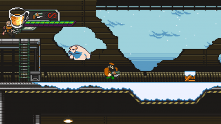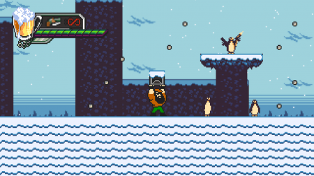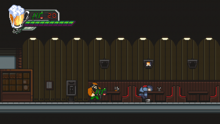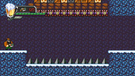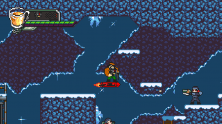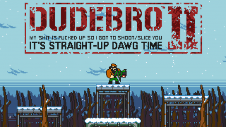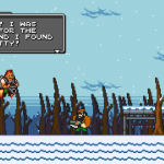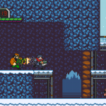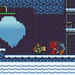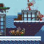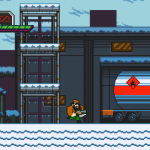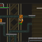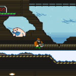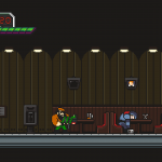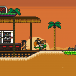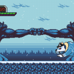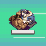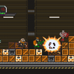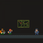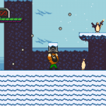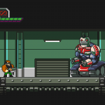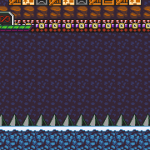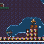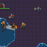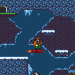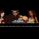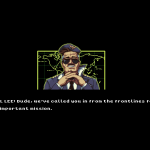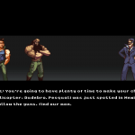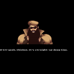
The recent gameplay trailer highlighted a major change in Dudebro II’s development; a switch to 2D sidescroller. But how, and when, this happened is a story worth telling.
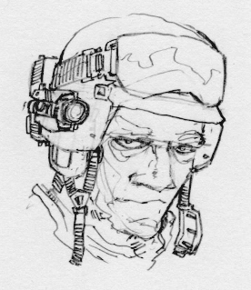
Those who had been following the game from the beginning would know about the original plan to create a 3D top-down shooter, with a team consisting of more than 130 volunteers. As time went on, several contributors dropped out, forcing a switch to 2D sprites for the characters instead of 3D models.
After the first screenshots of this version were released in February of 2011, even more key members left the project, leaving the team dangerously understaffed. Multiple delays and missed deadlines, including a missed E3 2011 trailer, led the team to rethink their approach. Around June of 2011, it became clear development would remain at a standstill or progress incredibly slowly for the foreseeable future. After all, there were tasks for over 50 people, yet the team had less than 10 active members. To be able to create a quality product in a reasonable time frame, the scope of the game had to be changed.
The decision was unanimous; Dudebro II would become a sidescroller. It was deemed preferable to simply cutting away features from the top-down version, which would have turned it into a shadow of its former self. With an all-new design the game wouldn’t have been affected in any way by the development issues of its former incarnation, and a much smaller — and determined — team would certainly have been more manageable.
A retro pixel art style was chosen, rather than to follow trends in the indie scene, as a purely practical means to create assets faster. It being a good fit for what the team is going for, was a fortunate side effect. For example, making a walking animation for the Dudebro sprite in the old build (link) took around a week, while making one for the new sprite didn’t even need a whole hour. With a much better time:work ratio, crazier ideas could be implemented to make the game world much more lively and interesting.
Abandoning the old style also meant abandoning the Unity engine that had been used up to that point. The replacement was XNA, as it was much more fitting for the 2D style, and it could offer a large amount of middleware readily available. Dudebro II may have switched to an old school look, but we didn’t want it to feel entirely retro. The team approached development with the goal to create something halfway between old and new, by utilizing modern features as well, such as particles, shaders and realistic physics.
Speaking of physics, the choice for the engine ended up being Farseer Physics. It allowed the game to keep its throwing mechanic, one of the team’s favorite features from the top-down version, and to give more flavor to the platforming. The team took quite a bit of time to tweak the engine, making sure everything had a good sense of weight to it, and not the floaty feel that has plagued many physics-based titles.
Throwing away a good chunk of the work we had already done to start from scratch was a bold and risky move for the situation we were in. The surprisingly good reception of the 2011 April Fool’s Day joke’s Nostalgia Cam, coincidentally made long before this decision came to be, made us confident enough to take the chance, and now we can say it has definitely paid off.
Everyone at the team agrees the new incarnation of the game is more fun, so we honestly believe it was a change for the better, and we can’t wait to reveal more of what we’ve been working on.
