Note: These screenshots show the old top-down build. To see how the game looks now, please click here.
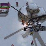
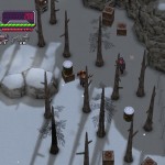
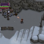
Today we finally released the first three Dudebro II in-game screenshots. As you can see, we are taking a different approach with the art direction than originally planned. The 3D character models have transformed into crisp 2D sprites that give off a more retro feel, and suit more the style of the game.
It should be noted that not everything is finalized. Some of the assets are just placeholders and will improve over time as development continues. The enemy count is also not indicative of the final product, as our current build already shows several more enemies on screen at once.
Ironically, the old bullshot actually looks worse. This shows how much things have improved since the last major development.
Check out the screens below!
 |
 |
 |

this is never going to comeout EVER!!!!!!!!!
More news are coming pretty soon!